On this page you will find chroma charts
for various services such as the railroads, how to read them, and a little bit
about light in general.
So what does any of this "stuff" have to do with railroads?
Chromaticity is how the color of a lens is specified.
From Wikipedia: Chromaticity is an objective specification of the quality of
a color regardless of its luminance. Chromaticity consists of two independent
parameters, often specified as hue (h) and colorfulness (s), where the latter
is alternatively called saturation, chroma, intensity (or excitation purity). End Wiki
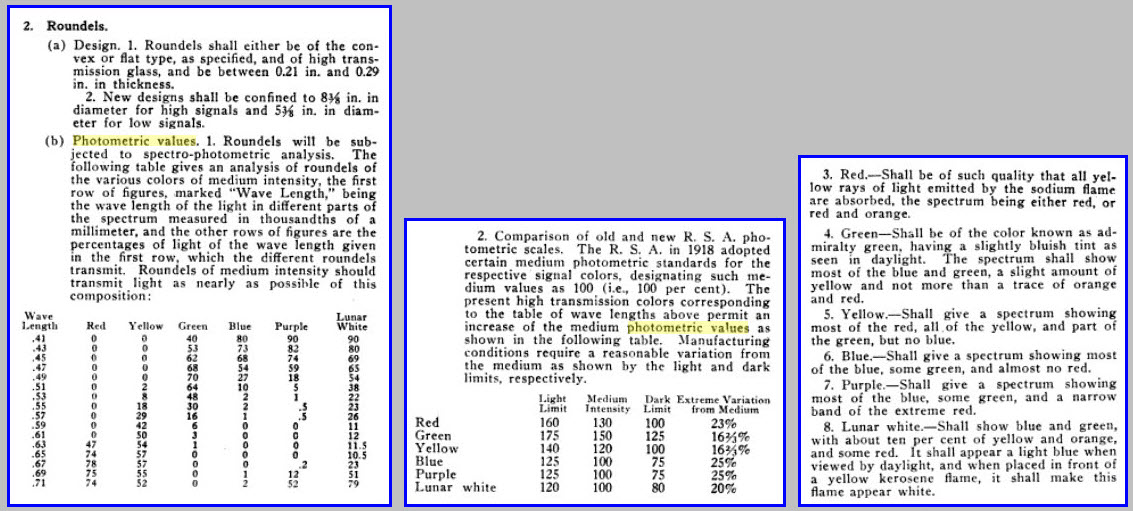
Specifying lenses in the railroad industry, or any other industry for that matter, has gotten
better over time as the charts below from my lens page shows us. This
comes from a PRR publication from the early 1900's.
Today, they are specified in terms of color/hue and saturation, and any
combination of the values within a defined area are acceptable. This is
especially noticed with green traffic light lenses, where some look more blue
than others.
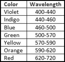
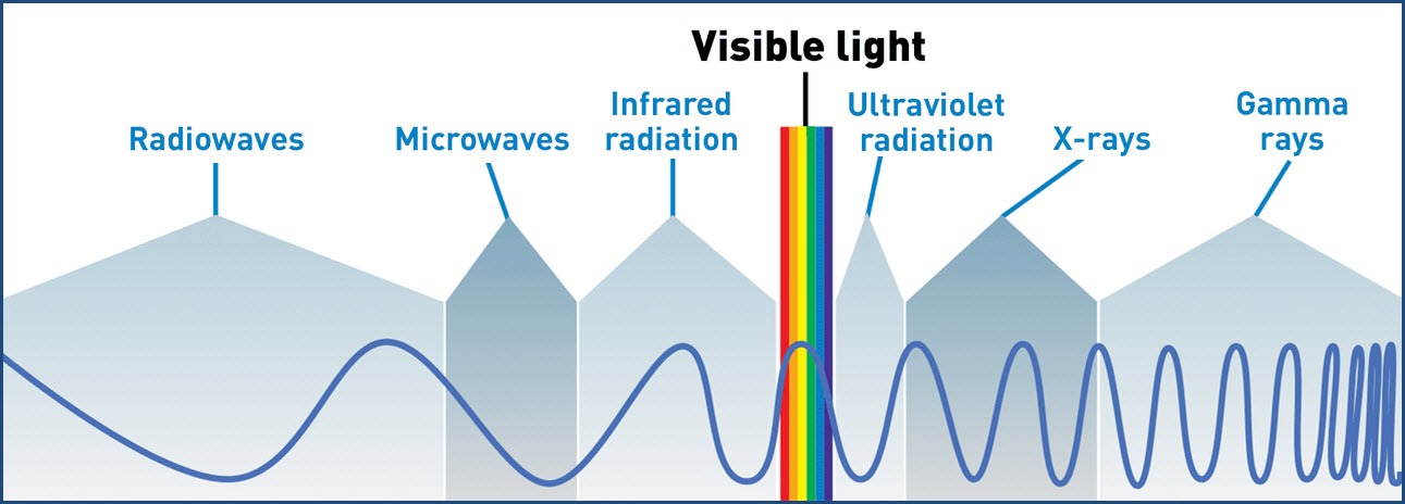
The human eye can perceive wavelengths of the light spectrum between 380nm
and 750nm, with violet at the shorter wavelength end, and red at the higher end.
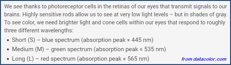
The human eye has two types of light receptors: rods and cones. Rods
transmit mostly black and white information to the brain, and as it gets darker
around us, are responsible for what we can see in the dark, this is why it gets
harder to see color in the dark. Rods also make up the majority of light
sensors around the eye and give us our peripheral vision. Cones on the
other hand, are mostly responsible for being able to see in color, and there are
three different kinds, seeing light in short (blues), medium (greens), and
longer (reds) wavelengths. Blue is the hardest color to see as more light
energy is required for a full response from blue-violet cones, compared to green or red.
(from the Pantone page)
Objects that appear white, reflect all wavelengths of light. Black objects
absorb all wavelengths of light. If you have a red apple, the only color
getting reflected is red, all others are absorbed.
Additionally, If you compare mixing colors with light, as opposed to paint, you will get
different results. This has more to do with the property of the paints
than it does with light. If you mix red and green light sources, such as
with an RGB LED, you will wind up seeing yellow. If you mix those two with
paint, you get a yucky brownish color. But that's whole 'nuther subject :-).
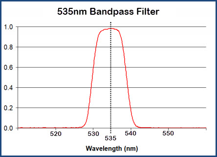
Lenses for the railroad industry have to take a (basically) white light
source, and filter out the unneeded colors. If you're into radios and RF
stuff, this is referred to as a bandpass filter. A bandpass filter only
lets through signals of a certain frequency, and in the case of light, it is
specified as wavelength instead of frequency. In early specifications,
this is referred to as the "transmission value" - Today, they would be ordered
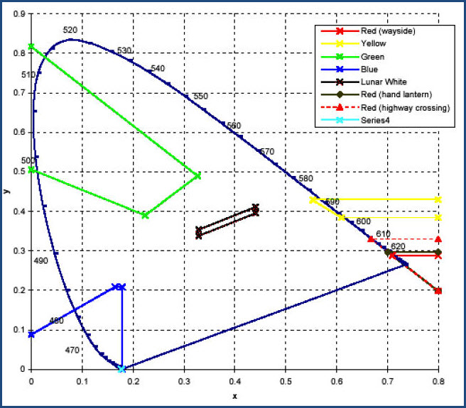
as AAR Green and so on, using the chromaticity chart shown below for the
railroads. The chart below illustrates
the bandpass concept:
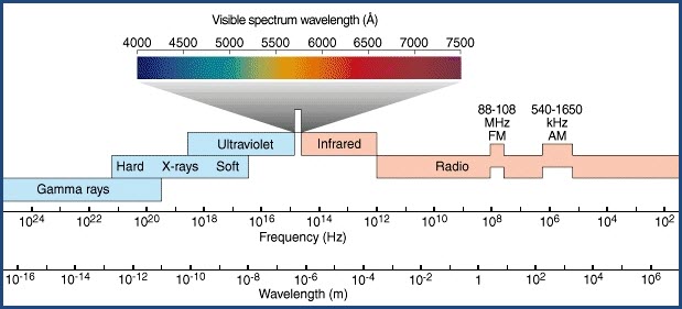
Below are a few charts that show where the visible light
spectrum is in relation to other "things" of/in the electromagnetic spectrum. The spectrum
starts off at "the bottom" with sound waves (frequency wise). We can not only hear
sound waves, but that wavelength can also be transmitted as radio waves.
Frequencies this low are known to penetrate water, so they are used to
communicate with submarines and require big antennas due to their wavelength.
As we progress in frequency, going ever higher, we go thru a variety of radio
frequencies - low, to medium, to high, then VHF (Very High Frequency) and UHF
(Ultra High Frequency), and then finally microwaves before getting into the
light spectrum with infra-red. Above purple, we have UV (Ultra Violet),
x-rays, and then cosmic rays. If there is anything above this, we so far,
don't have the technology to know.
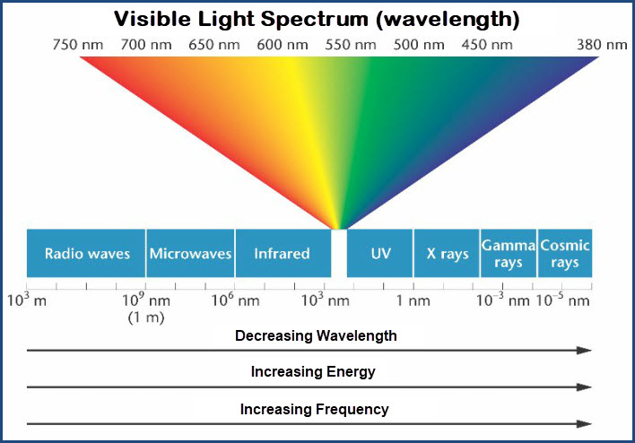
Keep in mind that when we talk about anything on the electromagnetic
spectrum, there are several ways of expressing the signal - frequency and
wavelength, and to a lesser degree, energy in Ev. When we get to the light
spectrum, we can also add the usage of another term into the mix: angstroms, but
its usage is declining, being replaced by the nanometre (nm). One
nanometre equals ten angstroms. From Wikipedia: The nanometre is also
commonly used to specify the wavelength of electromagnetic radiation near
the visible part of the spectrum: visible light ranges from around 400 to 700 nm.
The ångström, which is equal to 0.1 nm, was formerly used for these purposes. End Wiki
So here are a few charts to help visualize where the visible light spectrum
falls in the electromagnetic spectrum. Keep in mind, that many charts will
start with low frequencies on the left, increasing as we go to the right, which
puts infra-red on the left side of the color bar. Those charts that use
increasing wavelength as the main measurement (in nanometres), will have
ultra-violet on the left side of the color bar because the frequency is
decreasing as we go to the right.
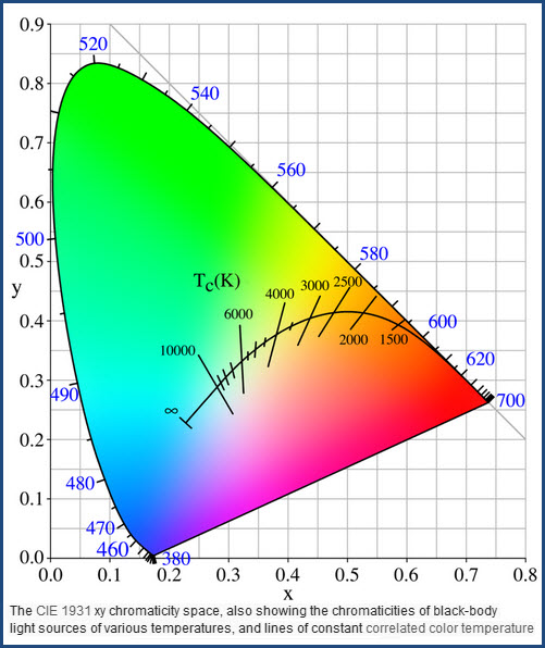
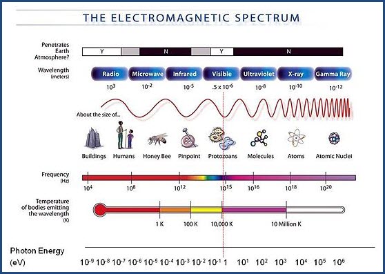
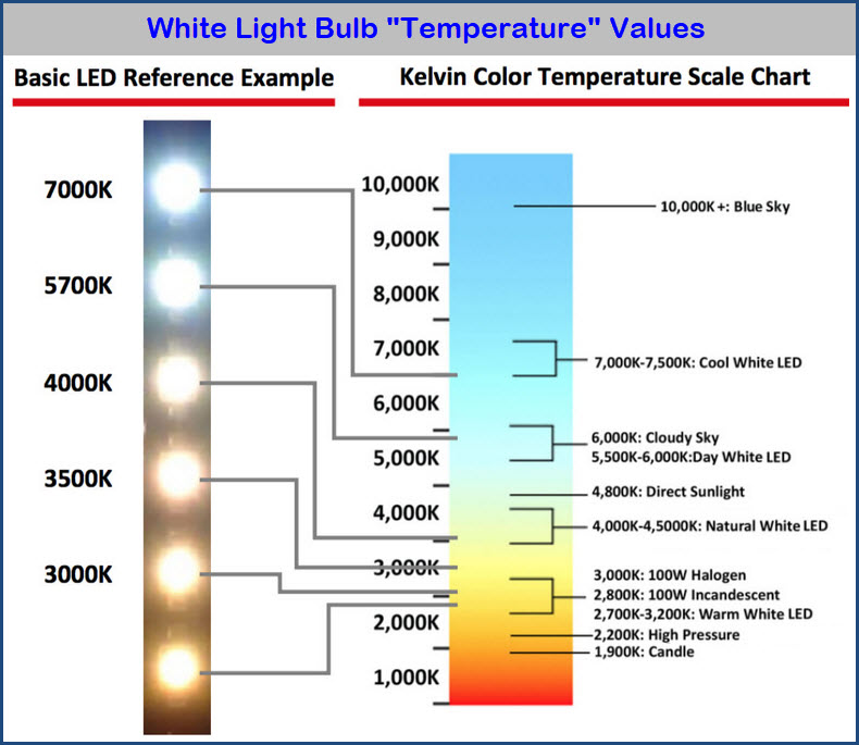
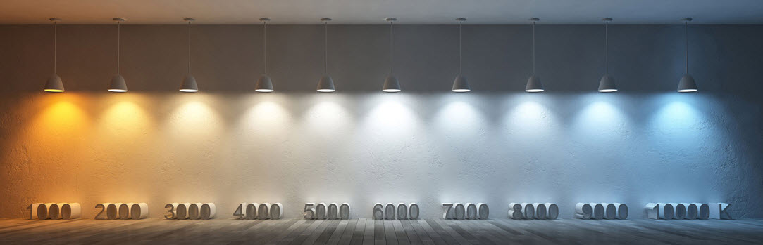
Going beyond, and slightly off topic.... You will notice, in the third chart above, that
they mention "temperature". You will see this when you go to buy light
bulbs, as white light is often expressed in these terms, with "cool white"
having a bluer tint to it, and "warm" light bulbs will appear more red.
I like this representation because it's well done artsy-fartsy :-) :-)
There is a lot to chew on here. For additional information on the
chromaticity chart, and why it looks the way it does, please refer to the links
at the top of the page, for they go into much more detail than I have room for
here. I will attempt to touch on some of the main points so you have some
idea how all this stuff works and relates to lens color.
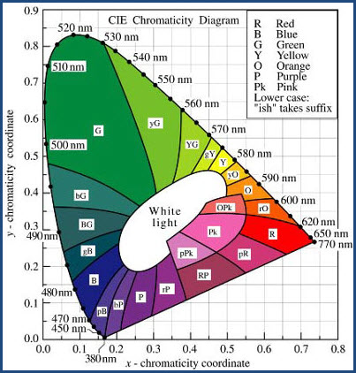
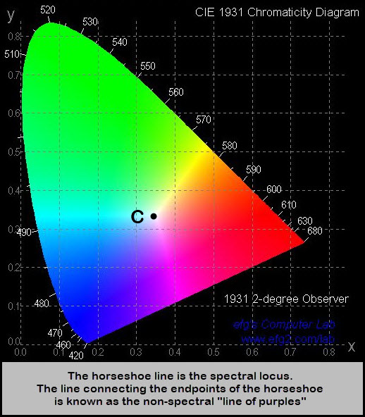
So this is a Chromaticity Chart, this one nicely displays the colors pretty much
as they actually are, and the center of curve is at "C", which is pure white.
Found
at efg2.com, but the page doesn't exist anymore.
Notice that in the chromaticity chart, that the spectrally pure colors are on the outer boundary,
or edge of the horseshoe shaped curve....
This is the curved line A-B-C on the left drawing below.
Points A and C are considered the endpoints of the curve.
Straight line A-C, between purple on the bottom left, and red on
the bottom right, is known as the non-spectral "line of purples".
Colors along this line do not have any wavelengths associated with them, because these are
"not real colors" -- these colors do not correspond to a
"natural" color, so you won't find those colors in a rainbow or the bands of
light made from a prism splitting white into its component colors.
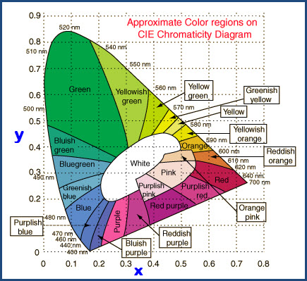
These charts offer you an idea of the colors, where
they are on the chart, what their wavelength is in relation to the color, and the
fact that as we go in towards the center, things get progressively whiter
(less saturated/more diluted, but of the same color).
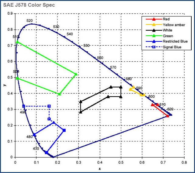
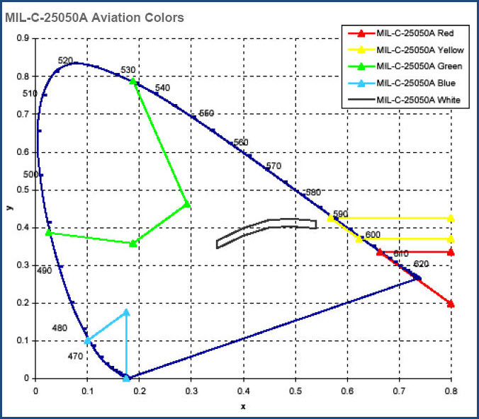
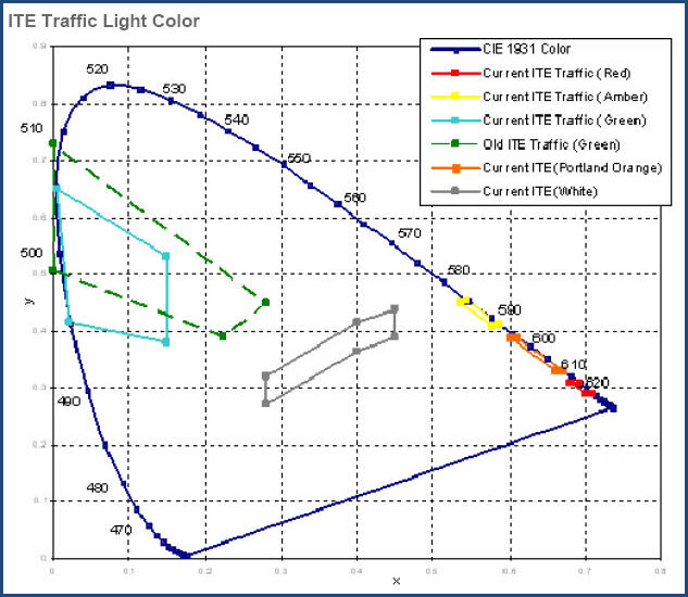
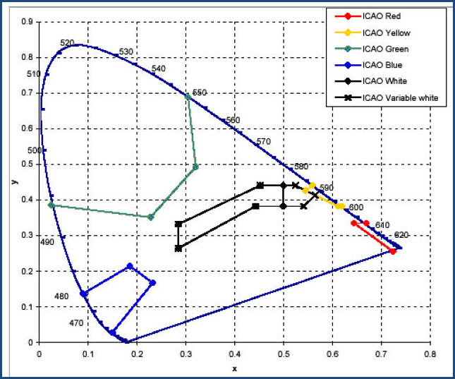
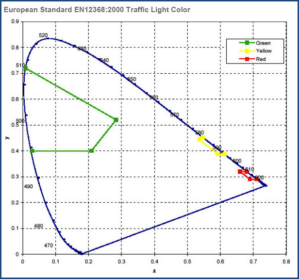
Most of the charts way below are self labeled as to the industry they cover.
You'll notice in these charts, that the X and Y axis' do not have units
associated with them other than the numbers - zero to 0.8 and 0.9. That's
because, to specify a color, we only need to give the coordinates of a point
on the chart.
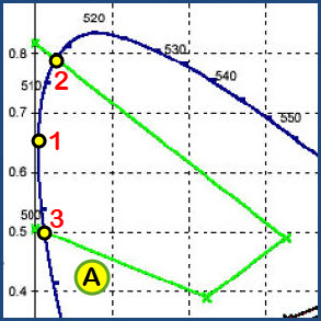
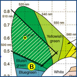
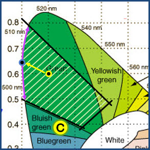
Let's say we want to have some green lenses made, we'll refer to the green portion of the FRA chart (A).
If we specify a point such as 0.1x, 0.6y (at the yellow dot), we will get a green
lens made of a certain color and saturation (B). But it won't be a "pure"
green, it will be slightly diluted because it is not on the outside edge of the green envelope.
If we want the lens to be a "pure" green, we could select the point
0.01x, 0.65y (C), which puts the green saturation at 100%. In fact, if we
picked a point anywhere along the purple arc, the green color would be "pure".
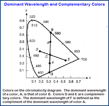
Maybe this diagram can help to explain:
If we move the point to the orange dot as in (D), the lens would be slightly
more "yellowish", but not a lot because the envelope for FRA green doesn't
go all the way over to the yellow-green area until we get to the less saturated
region towards the white.
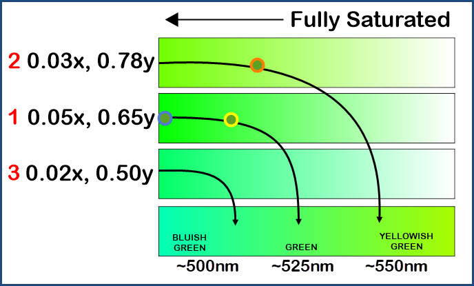
One thing most of the chromaticity charts don't do well, is to show an accurate
representation of the saturation level as we move from the outside to white in
the center. Using Corel Draw to help illustrate what I mean, look at the
following drawing. I use the points 1, 2, and 3 in (A) above as
my starting points. We'll call point 1 as the greener of the three
starting points. If we move to 2, it becomes slightly more yellow, and if
we start at 3, it becomes more blue. The color dots correspond to the
points in A, B, and C, and the yellow and orange dots are not completely
saturated - they are ever so slightly "diluted", or less green, but of the same
color. Are you confused yet? The bottom bar gives us the
colors (wavelengths in nm) as we go around the outside of the chroma chart, and the arrows point to
where the other three color bars are on that spectrum between bluish green and
yellowish green.
I touch on this on my lens page, but another thing to keep in mind as we think
about railroad signal lenses, is the light source in relation to the perceived
color of the signal.
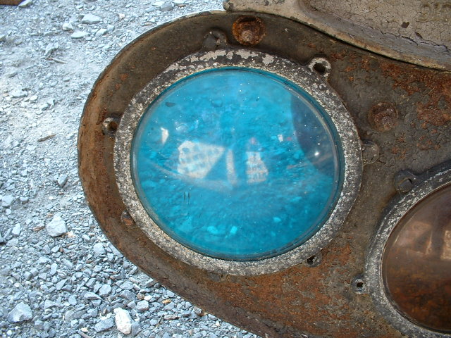
If we look at lenses made for semaphore signals when they were lit with a flame,
you will notice the lenses appear typically more blue than green, when comparing
them to a typical green lens of today.
This is because the design of the lenses back then had to take into account the
spectral purity of the "white" light produced by a flame in comparison to that
of an incandescent light bulb. A flame puts out very little in the blue
and a little in the green portions of the spectrum, but a lot in the red and yellow portion.
So, to get an indication that looked green, they made the lens "more blue".
 Found
at efg2.com, but the page doesn't exist anymore.
Found
at efg2.com, but the page doesn't exist anymore.